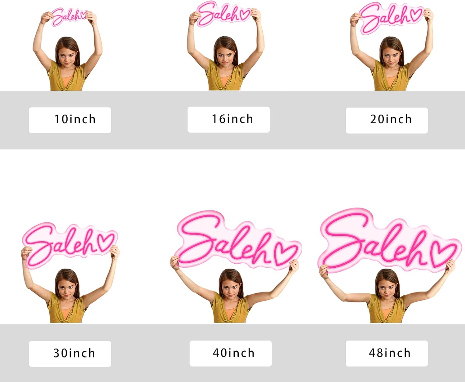
Neon Sign Sizing Mistakes: How Buyers Consistently Get It Wrong and How to Order Right
Ordering a custom neon sign — whether it’s LED flex tubing shaped into script lettering or genuine bent glass neon — should be straightforward: pick your text, choose a size, add to cart. In practice, size is where the majority of buyer regret lives. A custom neon sign is simply a shaped light source mounted on a backing board or hung as a standalone piece; the “size” on a product listing typically refers to the overall width of that backing board in inches, not the height of the glowing letters themselves. That gap between what the listing number suggests and what arrives on your wall is responsible for more one-star reviews, return requests, and re-orders than any other single factor. This guide walks through exactly where the math goes wrong, what experienced buyers do differently, and how to pressure-test your size decision before you hit submit — whether you’re installing a $180 nursery sign or speccing a $2,000 bar wall installation.
| EDITOR'S PICK[Super Large Neon Sign Happily E…](https://www.amazon.com/dp/B0C6P55512?tag=greenflower20-20) | Mid-tier[LC Sign Custom Neon Sign](https://www.amazon.com/dp/B0894PYCPT?tag=greenflower20-20) | Budget pick[Yatvro Custom Neon Signs](https://www.amazon.com/dp/B09M8NVC12?tag=greenflower20-20) | |
|---|---|---|---|
| Size | 60.26"×12.52" | — | — |
| Dimmer | ✓ | — | ✓ |
| Customizable | ✗ | ✓ | ✓ |
| Application | Bedroom/Wedding | Wedding/Events | Family/Bar |
| Sign Shape | — | — | 1 line |
| Price | $115.99 | $44.88 | $24.99 |
| See on Amazon → | See on Amazon → | See on Amazon → |
Why the Number in the Listing Almost Never Means What You Think
When a listing says “24-inch custom neon sign,” that dimension is almost always the width of the acrylic backing panel — not the lit neon element itself. The neon tubing typically sits inset from the board edge by anywhere from half an inch to two full inches on each side, meaning the actual glowing portion of a “24-inch” sign might read closer to 20–21 inches of luminous width. For short words or names, that gap is cosmetic. For longer phrases — “Mr. & Mrs. Rodriguez,” say, or a bar’s tagline — the letter height shrinks dramatically as the fabricator fits more characters across the same board width.
Letter height compounds this problem in a way that listing photos rarely communicate. On a 24-inch board displaying five letters, each character might be four to five inches tall — visible from across a living room. The same 24-inch board displaying eleven letters produces letters barely two inches tall, which reads almost as ambient texture rather than legible signage. Reviewers across aggregated buyer feedback consistently flag this: orders for custom surname signs in the 22–24 inch range with 10 or more characters arrive feeling “smaller than the photo suggested,” even when the physical dimensions were accurately listed.
One specific real-world data point that surfaces repeatedly in buyer reviews: a 22-inch sign ordered for an 11-letter name. At that ratio — roughly two inches of board width per letter — the individual characters sit close to 1.8 inches tall. That’s fine for a nightstand vignette photographed from three feet away. It is too small to read from across a standard bedroom, and it will completely disappear in event photography shot from 15–20 feet.
The fix before you order: Ask the fabricator for the letter height in inches, not just the board width. Any reputable studio will provide this on request; if they won’t, that’s a signal about their customer service quality before money changes hands.
The Wedding Arch Problem: When Bigger Is Right and When It Isn’t
Wedding installations expose the sizing problem from both directions simultaneously, which is why the pattern in review data is so striking. Budget sign buyers report disappointment at small-feeling pieces; wedding buyers report being pleasantly surprised that signs are larger than anticipated — and occasionally relieved that a piece they considered upsizing didn’t overwhelm their arch.
The Knot’s wedding signage coverage notes that neon backdrops for ceremony arches typically read best in the 36–48 inch width range for standard six-to-eight foot arch openings. At 36 inches, a two-to-four word phrase fills roughly 55–60% of a six-foot arch width, which reads as intentional without dominating. At 48 inches, the same arch starts to look sign-forward rather than floral-forward — which is the right call if the sign is the design statement, and the wrong call if the florals are.
One buyer’s decision to stick with a smaller size specifically because it “wouldn’t make the arch look too big” is a representative example of a calibrated choice. The lesson isn’t “always go bigger” — it’s “know your composition before you size your sign.”
The photography modifier: Signs that look proportional in person frequently read small in reception photography. A camera shooting from 15–20 feet compresses the apparent size of a sign relative to the human subjects around it. If your sign will be photographed — and at weddings, it will be photographed — add roughly 20–25% to whatever size reads correct in person. The reviewer who explicitly said “if you’re debating whether to upgrade size, totally worth it” after ordering a 36-inch version of a surname sign was likely calibrating for exactly this effect, even if they didn’t name it that way.
The Interior Installation Frame: Walls, Ceilings, and Sight Lines
For permanent residential and commercial installs, sizing errors tend to run small rather than large. A sign that looked substantial on a product page — often photographed against a plain white background with no spatial reference — arrives and looks like a light switch plate on a standard drywall wall.
Architectural Digest’s coverage of statement lighting in residential interiors consistently frames oversized light elements as the more common design mistake in professional installations, but in the custom sign category specifically, the opposite pattern dominates buyer experience. The reason: listing photography almost never includes a human figure or a piece of furniture for scale. A sign that is 18 inches wide and photographed tightly fills a frame. That same 18-inch sign on a 10-foot-wide accent wall reads as a decoration, not a statement.
By the numbers — bedroom sizing as a reference frame:
| Wall Width | Recommended Sign Width | Letter Height (5–7 chars) | Letter Height (10–12 chars) |
|---|---|---|---|
| 8 ft | 24–30 in | 4–5 in | 2–2.5 in |
| 10 ft | 30–36 in | 5–6 in | 2.5–3 in |
| 12 ft+ | 36–48 in | 6–8 in | 3–4 in |
Estimates based on standard fabricator letter-height ratios; verify letter height directly with your fabricator for your specific character count.
For rooms with standard 8-foot ceilings — the most common residential ceiling height — Apartment Therapy’s guidance on neon sign placement notes that signs positioned at eye level (roughly 60–66 inches from floor to sign center) read most naturally. At that position, a sign with letters shorter than three inches will be legible but not commanding. Letters four inches and above start to hold the room from a normal standing distance.
Sign Media’s coverage of LED flex neon production standards points out that the minimum practical letter height for legibility from 10+ feet is approximately 2.5 inches for simple sans-serif scripts; condensed or highly decorative letterforms need closer to 3.5 inches at the same viewing distance. This is a useful floor when calculating whether a listed board size will actually serve your installation.
Commercial and Event Rental Buyers: The Repeat-Order Trap
Bar owners, restaurant operators, and event rental companies building prop inventory face a compounded version of the sizing problem: they’re ordering for a space they know well, but photography from their own venue is what drives future bookings, and undersized signage photographs poorly at the distances involved in professional event shoots.
A branded bar installation shot from across a dining room needs letters at minimum four inches tall to remain legible at publication scale — whether that’s an Instagram crop or a venue’s website hero image. Architectural Digest’s interior design coverage routinely notes that commercial signage meant to double as photography backdrop should be sized for the camera’s perspective, not the operator’s in-person sight line.
For event rental inventory specifically: signs sized for intimate home installations (18–24 inches) will look small in any venue shoot. The minimum practical size for a rental sign that will hold visual weight in a standard ballroom or restaurant photo is 36 inches. The 48-inch tier is where rental operators who’ve done multiple events tend to land after their first “too small” experience.
Brides’ coverage of wedding vendor product selections notes that neon sign rental props in the 48-inch-and-above range consistently photograph better for couple and detail shots than smaller signs, even when the smaller sign felt sufficient during the in-person venue walkthrough.
How to Order Right: A Decision Rule
If you’re at the decision point right now, here’s a clear framework:
If your primary use case is photography (wedding backdrop, event rental, social content): size up one tier from whatever reads correct in the listing image. Add 20–25% to your instinct number, then round up to the next available size.
If your install is permanent and in a room 10+ feet wide: your instinct will almost always run small. Verify letter height in inches directly with the fabricator. A 30-inch sign with 10 characters at 2.5-inch letter height is a different product than a 30-inch sign with 4 characters at 5-inch letter height, even though they’re the same price tier.
If you’re debating between two adjacent sizes: the cost delta is almost always less than the cost of a re-order or the ongoing dissatisfaction of an undersized installation. One reviewer’s explicit advice — “if you’re debating whether to upgrade size, totally worth it” — summarizes what the aggregated review data shows across multiple product categories.
If you’re fitting a specific architectural element (arch, doorway, headboard niche): measure the element, then target a sign width that fills 55–65% of the available span. That ratio holds the space without consuming it.
Frequently Asked Questions
How do I know what size neon sign to order for a wedding arch backdrop? Measure your arch’s interior opening width. For a standard six-foot arch, a 36-inch sign fills roughly 50% of the span — enough to read clearly in photos without competing with florals. For a sign-forward installation where the neon is the hero, go 48 inches. Always ask your fabricator for letter height at the character count you’re ordering, not just board width.
Why does my neon sign look smaller than I expected compared to the listing photos? Listing photography almost never includes a scale reference — no furniture, no human figure, no wall context. The sign in the photo fills the frame, which makes it read large. In your actual space, the same physical object is one element among many. This is the most common source of size disappointment across buyer reviews.
Should I order the next size up for a custom neon sign? In most cases, yes. The price difference between adjacent sizes is typically $20–$60 at the consumer tier and rarely exceeds 15% at the commercial tier — almost always less than a re-order. Aggregated buyer feedback consistently shows more regret about going too small than too large.
How many inches tall should a bedroom neon sign be for a standard 8-foot ceiling? For a sign viewed from across a standard bedroom (8–12 feet), letter heights of 3.5–5 inches work well for short words; anything under three inches will read as ambient decoration rather than legible signage. On a typical 8-foot-ceiling bedroom accent wall, a 24–30 inch board with a short name or phrase at that letter height is a well-proportioned starting point.
Does a larger neon sign look noticeably brighter in the same room? Yes — more tube length means more total light output, and larger signs with the same wattage per foot of LED flex will appear meaningfully brighter. Owners across reviews note this as an unexpected benefit of upsizing. It also means a larger sign can serve as functional ambient light in a bedroom or bar setting, not just decorative accent.
Can I see a scaled mockup of my custom neon sign before production starts? Reputable fabricators — including most studios operating at the $300-and-above tier — provide a digital proof showing your text in the neon font at the ordered size before production begins. Ask explicitly for a mockup that includes a scale reference (a standard door, a person, or a furniture piece). If the studio only provides a floating image of the text with no spatial context, request an overlay on a room photo or ask them to confirm the letter height in inches. Studios unwilling to provide either are a quality signal worth acting on before committing.